
Make Yourself At Home – Part 2
This is the second part of my report on Get Living London’s Colour Psychology Masterclass – read Part 1: Make Yourself at Home with Ashlyn Gibson
Make Yourself At Home with Karen Haller
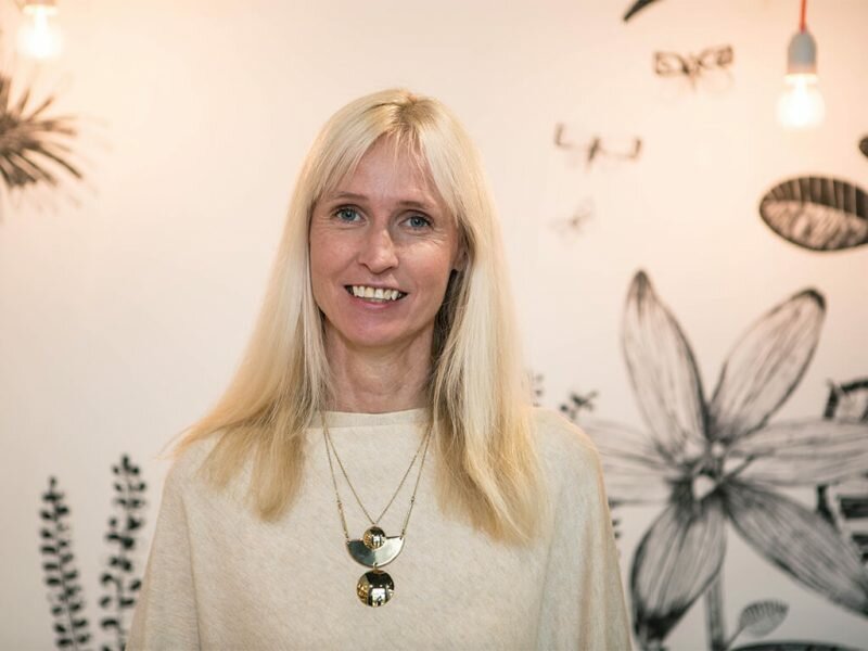
Karen Haller (pictured above), the internationally-renowned colour psychology expert, has been working with Get Living London, to provide resources to encourage and enable renters at East Village E20 to personalise their homes with colour. I was lucky enough, along with other bloggers, to attend Karen’s Colour Psychology masterclass, and find out more about her work with Get Living London’s Make Yourself At Home campaign. I gleaned loads of information about colour psychology that I can apply to my own home, so I am sharing with you!
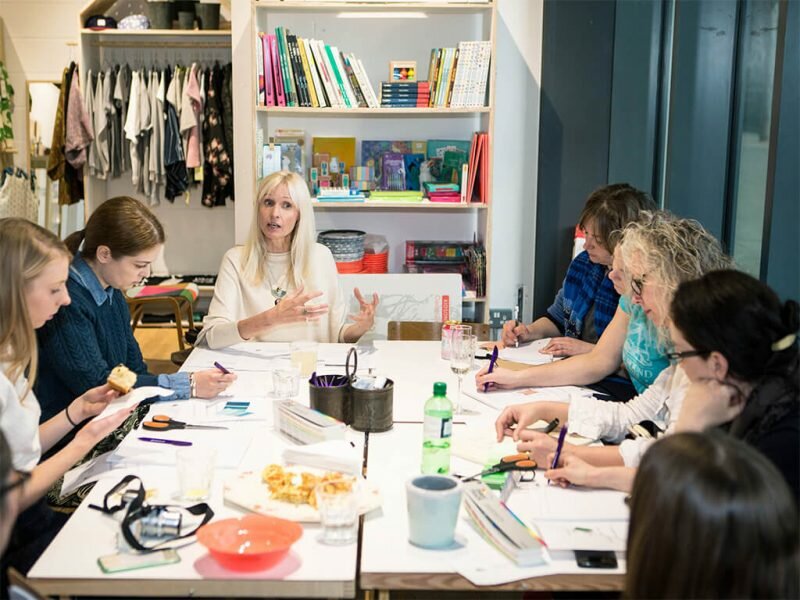
you can see we are all taking this very seriously and writing down Karen’s every word (when we weren’t eating cake of course – Natalie?)
We had been encouraged to bring an example of our favourite colour to the event, to explore what it says about us. My choice was emerald green, and as I made my way across London I grabbed some deep glossy leaves from a park to bring with me as colour-samples. However, being a country bumpkin and not used to navigating the city in rush hour, I arrived late, so missed the part of Karen’s workshop that explored what our choice of colour says about us. Perhaps it says I am bad at planning!
Writing down what I thought my choice of emerald green reveals about me, I suggested that it said I am a nature-lover, like rich colours and textures, and that I am fairly down to earth. Since then, checking out The Design Sheppard’s interview with Karen Haller about emerald green, it looks like I was not too far off with my analysis 🙂
Karen’s work with Get Living London is based on research that shows just how scared of colour the British home-decorating public is. Some facts:
· 95% of Brits are too scared to go all out with colour in their homes
· Despite 60% admitting it would improve their wellbeing
· Renters across the nation struggle the most with colour as rental restrictions leave them stuck in boring spaces
Karen explained that there are three key factors that influence the way we feel about colour. They are: 1) Psychological 2) Personal and 3) Cultural. Take for example the colour red – psychologically it is energising, red chairs in a boardroom might keep everyone alert during a meeting, but too much red, say a red wall in the same boardroom, might be too stimulating and make for heated debate; on the personal front, you might have had a horrible red school uniform, which you hated, and therefore your personal association with red is a negative one, and you avoid the colour because of that; culturally, red is the colour of good luck in Asia, and so a positive colour association in that part of the world, whereas in Russia it is associated with revolution.
Bearing these three factors in mind, Karen proposed investigating why people don’t like a particular colour, and then to disassociate colour from personal meaning. In this way we can reclaim colours that have a positive effect on one’s mood and behaviour, that we might not have considered before. As an example, Karen talked about the blue for boys/pink for girls 1940s marketing campaign that has been affecting our opinion of those two colours ever since. Time to reclaim these colours as gender neutral, as perhaps Pantone are doing with their choice of Rose Quartz and Blue Serenity as Colour of the Year 2016.
Despite colour psychology being quite a science, Karen and the Get Living London team combine their research and knowledge with an accessible approach, making it easy to apply colour psychology to everyday interiors. Karen explains:
“It’s important that Brits trust their intuition when it comes to injecting colour into their lives. In our modern society, we are becoming more and more afraid to embrace colour, even though we know it will benefit us, mainly because we are afraid we’ll get it wrong. Too often we are sticking with creams and magnolias which although called neutrals, are not psychologically neutral and can in fact have a negative impact on our wellbeing … I have seen time and time again that adopting a colour scheme that’s right for an individual or a family can have a tremendously positive impact in their daily lives.”
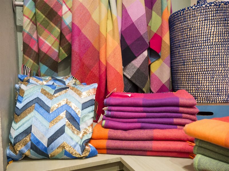
Even if you are renting and have a no-decorating clause on your contract (if you are not renting in East London Village that is) you can still inject colour with accessories. Here are some colourful rugs and throws at Avoca, Dublin (snapped on my recent visit there)
Another fact that Karen shared was that 72% of Brits have decorated their homes for other people to like, not for themselves and to their tastes. In counter to this, Karen suggests a three-point plan for making your home your own using colour. For each room in your home you should consider:
- Purpose (what is the purpose of the room? what are the types of activities?)
- Feeling and Behaviour (how do you want to feel in this room and what positive effect do you want the room to have on the behaviour of the people using it?)
- Colour expression (choose a combination of colours that resonate with you to give you this feeling and positive behaviour)
Karen also recommends experimenting with adjusting the proportion of each colour and the placement to create the desired feel. For example, green can be harmonious and balancing, but too much of it and a room can take on the negative associations of green – it can become like a stagnant pond, stifling growth!
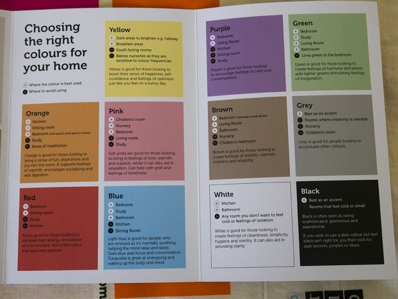
Karen has worked with Get Living London to produce a guide to choosing colours for your home, and an interactive quiz which matches personality type to its perfect colour. The aim is to make choosing colours fun, and to encourage people to be more confident when it comes to decorating. The quiz is available on the Get Living London site: www.getlivinglondon.com
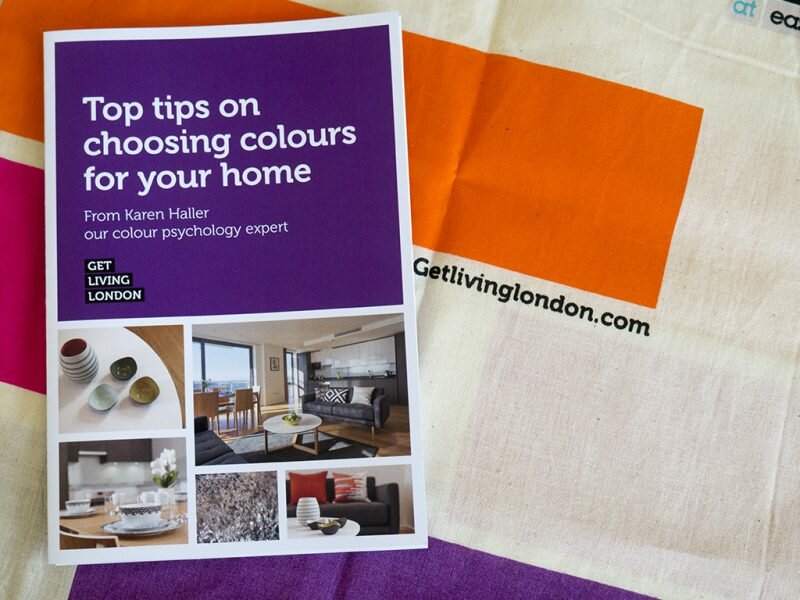
I took the colour quiz and funnily enough, it came back with green as my perfect colour match – the very colour I chose as my own favourite.
I thoroughly enjoyed this introduction to colour psychology, and it has encouraged me to think more deeply about colour and also be less afraid of it. As Karen says we are all innately born with loving colour, so why not embrace what it can do for you and your home.
Thanks to Get Living London for hosting this event. Please do take the colour quiz and let me know in the comments below what it reveals – I’d love to know!
(Remember if you missed Part 1 of my report on Get Living London’s Colour Psychology Masterclass, you can read it here: Make Yourself at Home with Ashlyn Gibson)
Linking up with:



Twitter:
on April 27, 2016 at 7:25 am
I love colour, but I try to add the bulk of it in areas like curtains, rugs and accessories. I’ve found I tire of strong colours painted on walls almost immediately! I could never go monochrome, definitely need some colour!! Xxx
I think that’s a good way to use colour Kerry – you can then add as much or as little as you like and move things around. Karen said that people often choose monochrome because it’s both trendy and easy (black and white go together, job done) but she also says that white blocks emotions (which is why it is used in mental institutions) so it can lead to feelings of coldness and loneliness 🙁
Twitter:
on April 27, 2016 at 10:51 am
Love your write up of the event Molly and don’t worry, you weren’t as late as me! *blush*
Some really great takeaways weren’t there? The stats don’t surprise me though. I’m helping my mum to completely redecorate her home at the minute and she has so far picked out items in beige and vanilla haha x
Have you got your mum to take the quiz? I’m working on getting more colour into my beige central flat since the event, really enjoyed it (and it was lovely to meet you!)
Twitter:
on April 27, 2016 at 11:11 am
I haven’t just yet! Although I did ask her the 4 questions from Ashlyn’s session to little success haha I’ll try her with the colours.
Lovely to meet you too! Hopefully get a proper natter next time 🙂 x
Twitter:
on April 27, 2016 at 1:19 pm
So gutted I missed this looks really interesting!!
Real shame you couldn’t make it – was very interesting, and fun!
Twitter:
on April 27, 2016 at 8:02 pm
Some interesting facts Molly, I’m surprised that 72% of people decorate for someone else though, food for thought.
Jen recently posted…Why I Don’t Always Like Sharing My Home on the Blog
Crazy isn’t it. We had a lot of dark furniture growing up and I assumed that was my mum’s taste, only to find out years later that she hated it but that’s what the neighbours had and so she went along with the trend. I think what Karen was saying is that people decorate in a way that they think will make their home appealing to others, and I suppose we all do have an eye on what we think is fashionable or acceptable?
Twitter:
on April 27, 2016 at 10:01 pm
Ooh now seeing part 2 I really wish I could have gone to this event – do you know if there will be more? Such an interesting read- thanks for sharing #homeetc
Thanks for reading both 🙂 The session with Karen was actually the first part of the evening, I just wrote them up the wrong way round! Glad you found it interesting. I really don’t know if there will be more, but perhaps if you tweeted Get Living London (@GetLivingLDN) they could let you know?
Twitter:
on April 28, 2016 at 7:22 am
This is SO interesting!!! I’ve just taken the test and came out as yellow, which is pretty accurate. I love spring/summer colours so I have a lot of yellow, fuchsia and orange in my house. I find them really cheerful and positive to be around. I’m spoilt with greens because we have a forest in front of our house …. maybe that’s the reason I don’t feel a need to have so much green in my house even though I love the outdoors. I’d love to learn more about this.
That’s lovely you got yellow – so cheerful! Glad you found it interesting. Stacey on The Design Sheppard did a series of posts with Karen Haller, so you could browse them to read more? x
Twitter:
on April 28, 2016 at 1:54 pm
It sounds like a fascinating day, thanks for sharing your write-up. That’s interesting that so many people decorate their houses with other people in mind.
Thanks Rachel, it was very interesting.
Twitter:
on April 28, 2016 at 10:58 pm
Thanks for linking to my interview with Karen. I’m fascinated by colour psychology and would have loved to go to this event. For years I really struggled in floor to ceiling magnolia rentals. But now that we own our flat I’ve been really quite brave with colour opting for a dark moss green in the living room and a dark blue in the bedroom. I can’t begin to tell you what a difference it has made to the way I feel about my home. Colour really is a game changer and I hope that more Brits embrace it. I just took the test and it came out with blue which is definitely my favourite colour. It even had a picture of a wall that is almost identical to the shade in my bedroom. Uncanny. Thanks for the lovely write up, most interesting.
Twitter:
on April 29, 2016 at 10:43 am
Fascinating subject, I bet it was so interesting learning about this. Overall I think I like light, subtle colours, but am drawn to the occasional deep green, grey or blue for impact!
Twitter:
on April 29, 2016 at 12:22 pm
I would have absolutely loved this event — if only to hang out with you and Lins for the afternoon! 🙂 You know me — I’m a real fan of colour. I love the all-white scandi inspired rooms but I’d never, ever be able to live in them. Colour would end up infiltrating the room eventually!! 😉 Thanks so much for linking up with us, Caro x#HomeEtc
Caro recently posted…Welcome Home | The GLTC Showroom Launch Party
I so wish you could have been there too – but hopefully I’ll get up to more events this year and we can hang out 🙂